Dashboard
The dashboard allows users to scope the dashboard at the collection level and view visualizations of the results of test cases. Users can add multiple dashboard components to see the statistics and customize the title, collection, days, provider, compliance, and services. The visual graphs offer better visibility of the environment, and there are three types of visualizations available, including secure score circle/pie percentage graphs, remediation/vulnerability track line charts, and security posture pie charts/bar graphs. Users can also delete dashboard components if they do not want to see any dashboard component's stats. Overall, the dashboard feature provides useful insights into the security of the cloud environment.
Admin Dashboard
After logging in to the Prancer Web application, the user can see the dashboard screen.
- User can see the statistics of the failed and the passed test cases.
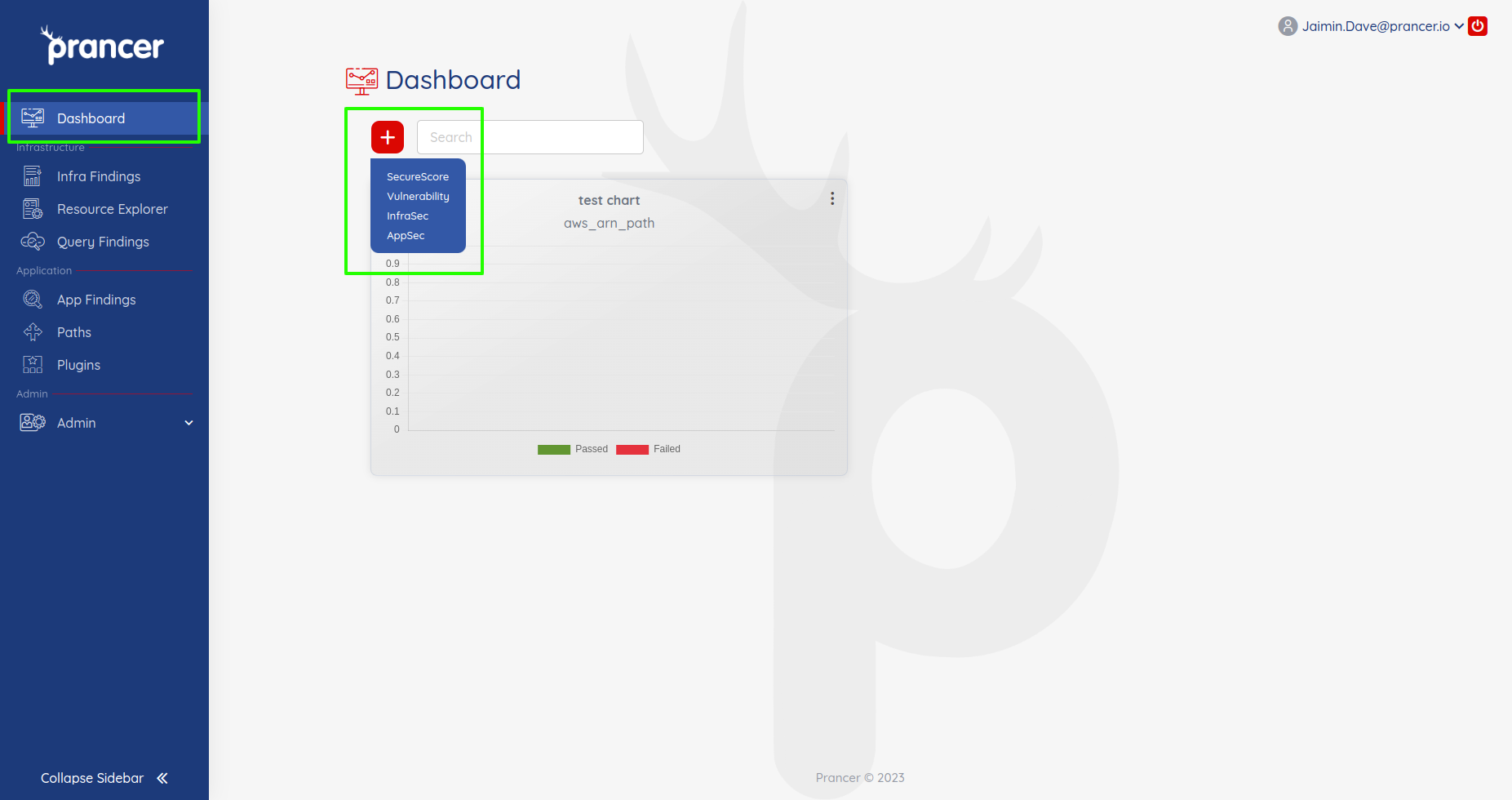
Add Dashboard Component
- Users can add multiple dashboard components to see the statistics.
-
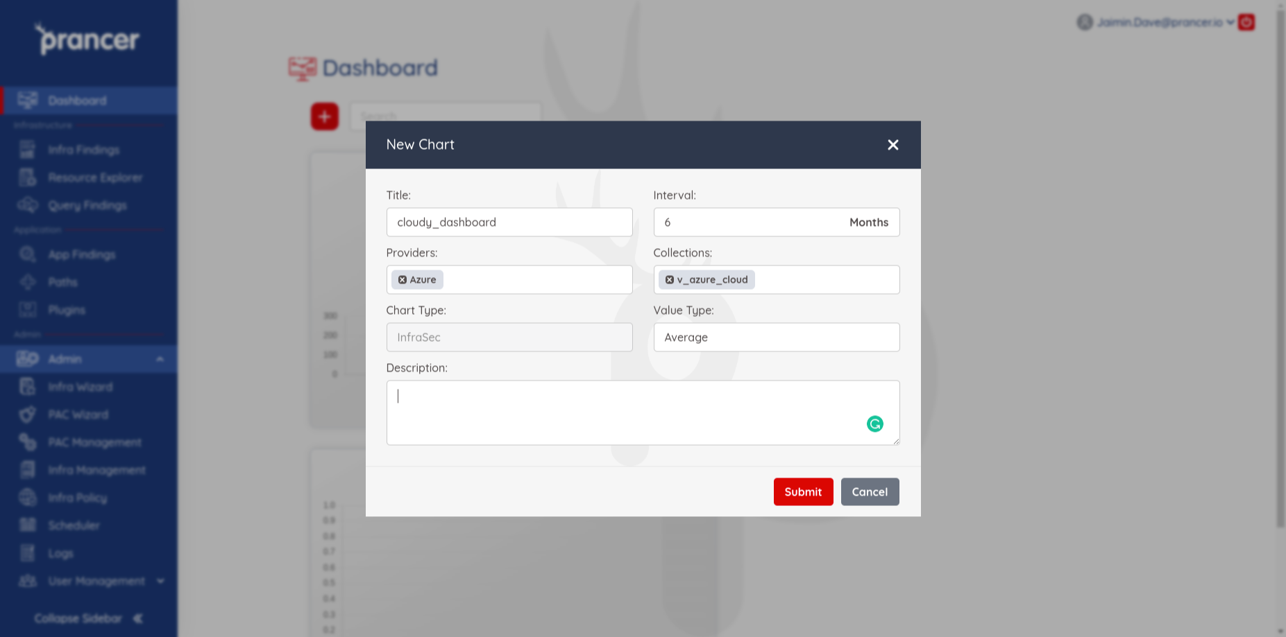
Users can set the following items at the time of creating the component.
-
Title: Add the title of the Dashboard component.
- Collection: user can select a single collection name from the list of available collections.
- Interval: Add the no. of days or months for which you want to see the stats.
- Provider: Select a single provider from the list.
- Chart type: It can be of the following type.
- SecureScore
- Vulnerabilty
- InfraSec
- Appsec
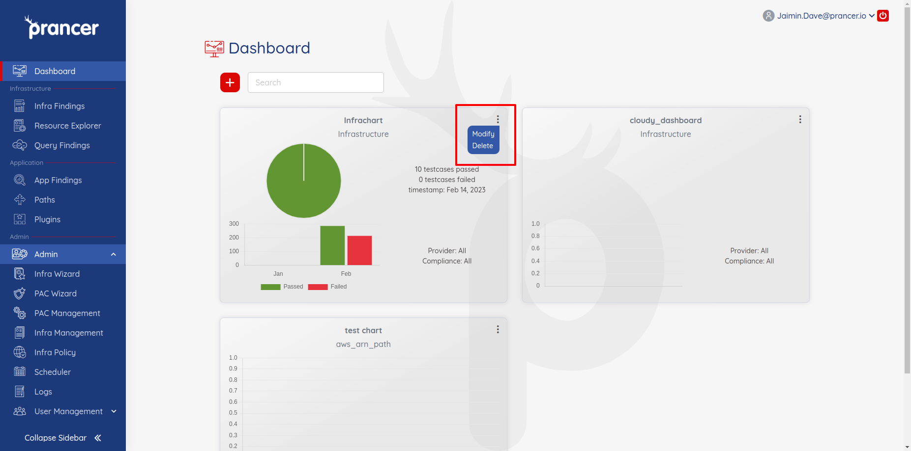
Delete or Modify Dashboard Component
If the user does not want to see any dashboard component's stats, they can remove that component by clicking on the delete option and can modify by clicking on modify.